Every decade, in retrospect, has a visual style that comes to feel inevitable. The 1970s have their grain and their saturated film stock and their sun-bleached compositions. The 1990s have their flash-lit harshness and their fashion-photographic crispness. The 2000s have their digital crispness and their early-Instagram desaturation. The styles seem, when one is inside them, to be the natural way images appear. They are, of course, no such thing. They are conventions, and they have their reasons for existing, and they pass.
The image style that defines the current decade is already visible to anyone who pays attention. It is the style of the algorithmic feed — bright, color-graded toward warm shadows and cool highlights, composed to read at thumbnail size, optimized for the half-second of attention that the feed allocates before scrolling. The style appears across photography, illustration, video stills, advertising, and increasingly across the work that aspires to be considered serious art. It is the visual lingua franca of the moment.
The style itself
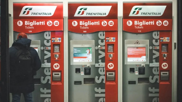
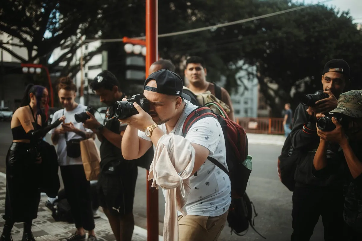
The style has identifiable elements. The color grading favors a desaturated warm-cool palette — orange-leaning skin tones, teal-leaning shadows, the entire image pulled toward a specific narrow band of color that reads as cinematic without being any specific cinematographer's actual style. The compositions tend toward the symmetrical and the centered, because thumbnail-scale viewing rewards immediate legibility. The lighting tends toward the dramatic — strong directional sources, deep shadows where the image structure permits, occasional rim-lit silhouettes.
The textures favor smoothness. Skin is smoothed; surfaces are rendered evenly; the grain and noise that characterized the photographic styles of earlier decades is largely absent. The smoothing is partly technical — the algorithms that produce this work include smoothing as a default — but it is also aesthetic. The smoothness signals a particular kind of competence, a particular relationship to the medium.
Why this style and not another
The style exists for identifiable reasons. The platforms on which images circulate have specific affordances. Thumbnail-scale viewing rewards immediate legibility, which selects for centered compositions and high contrast. Algorithmic ranking systems reward engagement, which selects for emotional intensity in the moment of viewing. The production tools — the editing apps, the AI generation systems, the increasingly common color-grading presets — converge on similar default settings, which means independent producers using different tools tend to produce work that looks similar.
The style is not, in this account, a choice that any individual producer is making against alternatives. It is the choice that emerges when many producers, working with similar tools toward similar incentives, optimize against similar constraints. The result is a style that feels inevitable from inside the system but that an observer from outside the system would recognize as a specific convention.
The blindness from inside
One marker of a dominant style is that its practitioners largely cannot see it. The producers of the style are aware that they are making aesthetic choices, but the choices feel to them like local decisions — what color grade to use here, what crop to use there — rather than participation in a wider convention. The convention becomes visible only from outside, either from a critical distance or from a chronological distance.
This blindness is not unusual. The producers of the 1970s photographic style were largely not aware that they were creating a 1970s photographic style; they were making the images that seemed natural to make with the tools and conditions available. The style appears to be a style only in retrospect. The same will be true of the contemporary style, which will look more obviously dated in fifteen years than it does now, when the dominance feels merely like normality.
The conditions for change
Image styles change when the conditions that sustain them change. The shift away from the 1970s film aesthetic was driven by the technical shift to higher-resolution film stocks and, eventually, to digital. The shift away from the early-digital aesthetic was driven by the platforms and their reward structures.
The contemporary style will shift when one of its supporting conditions shifts. The platforms could change their reward structures. The tools could change their defaults. The producers could reach the point of aesthetic exhaustion with the style and begin to seek alternatives. Each of these is a plausible path; which one will trigger the shift, and when, is harder to predict.
What is more predictable is that the shift will happen. Image styles do not persist indefinitely. The pressures that produce stylistic change — the platforms' need for novelty, the producers' search for distinction, the audiences' fatigue with repetition — are persistent and eventually catalyze change. The current style will, at some point in the next decade, begin to look dated. It will then become available for nostalgic recovery in some later decade, where it will be appreciated as the look of a specific historical moment.
The alternative styles already visible
The alternative styles that may eventually displace the current convention are partly visible in the work of producers who have grown weary of the convention. Some of this work returns to film aesthetics — grain, saturated chemistry, the specific texture of photographic emulsion. Some of it embraces the deliberate awkwardness that the smooth contemporary style edits out — overexposed highlights, harsh shadows, off-center compositions that reward sustained looking rather than thumbnail glance.
None of these alternative styles has yet achieved the dominance of the contemporary convention. They exist as minority practices, sustained by the producers and audiences who have grown weary of the convention but who do not yet have the numbers to displace it. Whether one of them, or some currently invisible alternative, will eventually become the dominant style is uncertain.
The slow viewer's response
For the viewer who wants to see images well, the appropriate response to the contemporary style is the same as the appropriate response to any dominant style: to see it as a style. To notice when an image is participating in the convention and when it is making choices outside the convention. To attend to the specific decisions in any given image rather than absorbing it as the natural way images appear.
This is harder than it sounds, because the convention is so pervasive. But it is the discipline that allows the viewer to see the genuinely interesting images of the current moment — the ones that are doing something other than the dominant style — and to recognize what makes them different. Without this discipline, the dominant style becomes the unmarked default, and the alternatives become invisible.
The slow viewer learns to see the style. The slow viewer is then in a position to see, with similar attention, the style that will come next — when it begins to appear, perhaps already in fragmentary form, in the work of the producers who are looking for what comes after.